
Speed, immersive experiences and intentional design are replacing static templates. These are the ten trends worth knowing, and which ones to be careful with.
Key takeaways
- The strongest trends make a site clearer, faster or more memorable. The weakest are decoration.
- Immersive 3D, scroll-driven storytelling and bold typography work best when they support the message.
- Performance, accessibility and dark mode are no longer extras; visitors expect them.
- Every effect should earn its place. If it slows the page or hides the content, cut it.
Trends are tools, not goals
Every year brings a fresh list of web design trends, and every year some sites adopt them all and end up looking busy, slow and forgettable. The point of design is not to be fashionable; it is to help a visitor understand what you do and take the next step. With that in mind, here are ten trends that are shaping good websites right now, along with a note on how to use each one well.
1. Immersive 3D and interactive visuals
Modern browsers can render 3D scenes smoothly, which lets a site show a product, an idea or a process in a way a flat image cannot. A well-made interactive scene can explain a workflow or make a brand memorable within seconds. Use it where it adds meaning, keep the file size under control, load it only when it is on screen, and always provide a clear, fast fallback for devices that cannot run it.
2. Scroll-driven storytelling
Instead of a long wall of content, sections reveal themselves as the visitor scrolls, with pinned panels, horizontal sections and gentle transitions. Done well, it turns a page into a guided story. Done badly, it traps the user in a scroll they cannot control. Keep the pacing natural, never block normal scrolling, and make sure every important message is readable without any animation.
3. Bold, expressive typography
Large, confident headlines are replacing timid text and generic stock photos. Strong type carries personality and hierarchy on its own, and it loads faster than heavy imagery. Pair a distinctive display font with a clean body font, check contrast, and make sure text stays readable on small screens.
4. Dark mode and theming
Many people now expect a site to respect their device setting, and some simply prefer a dark interface at night. Offering both a light and a dark theme, and remembering the visitor's choice, is a small touch that feels considerate. Design both properly rather than inverting colours, and test contrast in each.
5. Bento and modular layouts
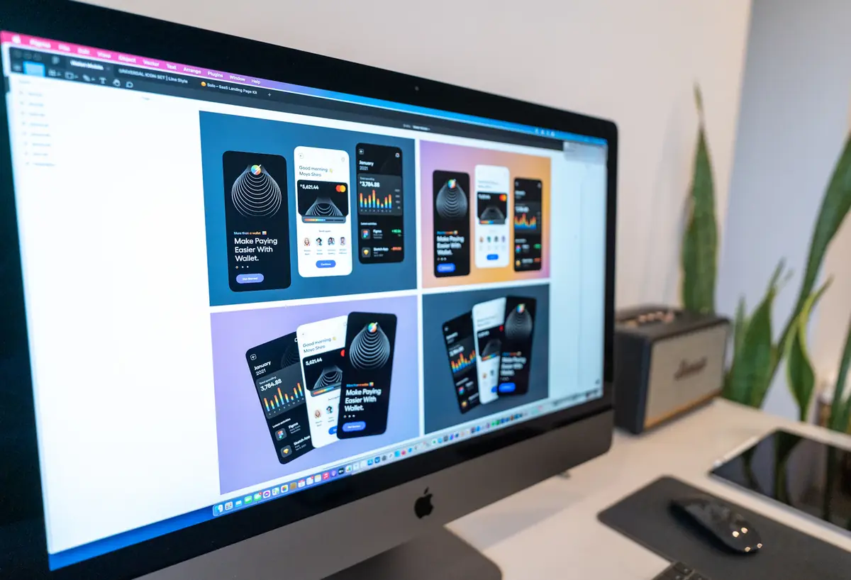
Grids of differently sized cards, inspired by Japanese bento boxes, are an efficient way to present several ideas at once, such as features, results or services. They work well on both wide and narrow screens because each block can reflow. Keep the hierarchy clear so the most important block stands out.
6. Purposeful micro-interactions
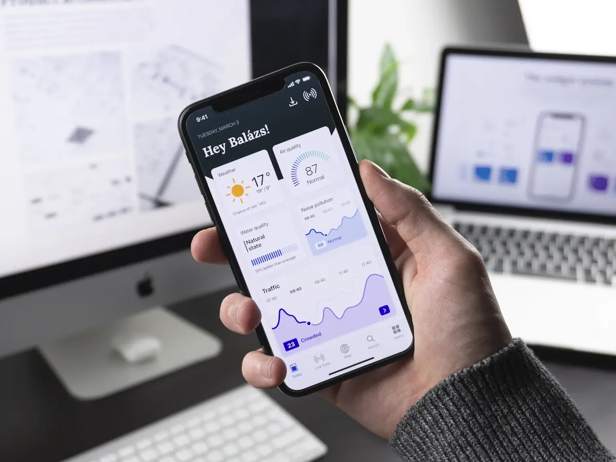
Small movements, such as a button that responds to a hover, a menu that slides open or a form field that confirms a valid entry, make a site feel alive and give useful feedback. They should be quick, subtle and consistent. If an animation makes the user wait, it is working against them.
7. Performance-first design
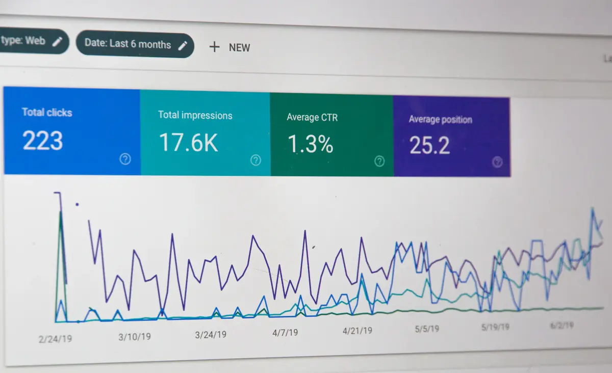
Speed has moved from a technical detail to a design requirement. Designers now think about image weight, font loading and animation cost from the first sketch, because a beautiful page that loads slowly is not beautiful to the visitor. Pre-rendered pages, modern image formats and lazy loading are the building blocks.
8. Accessible design by default
Good contrast, readable text sizes, visible focus states, keyboard navigation and support for reduced-motion settings are signs of quality, and they widen your audience. Accessibility is also good for SEO and usability for everyone. Build it in from the start rather than patching it afterwards.
9. Authentic imagery and real people
Visitors have grown tired of generic stock photos. Real photos of your team, your work and your customers build trust far better. Where you must use stock, choose images that match your brand colours and tone rather than the first result you find.
10. Personalised and context-aware experiences
Sites increasingly adapt to the visitor: the right language, the most relevant services, a returning customer's previous choices, or a shortcut to the most likely next step. Use personalisation to remove friction, not to feel intrusive, and be clear and respectful about how data is used.
What to be careful with
- Motion for its own sake. Every animation should clarify something or guide the eye.
- Heavy effects on low-powered phones. Test on a mid-range device, not just your own machine.
- Hiding navigation or key information behind clever interactions.
- Copying a trend that does not suit your audience. A law firm and a creative studio need different tones.
How to apply this to your own site
Choose two or three trends that genuinely fit your brand and audience, and do them well rather than adding all ten. Test the result on real devices, measure the speed, and make sure the message is clear within the first few seconds. If you would like a site that is distinctive, fast and built for search, we can help you design and build it.
Frequently asked questions
Do design trends affect SEO?
Indirectly. Heavy effects can slow a page and hurt user experience, while fast, accessible and clearly structured pages tend to perform better. Content and technical quality remain the foundation.
Is 3D on a website a good idea for a business?
It can be, when it explains something or makes the brand memorable and is built to load quickly. It should never replace clear content or slow down the page.
Should I offer a dark mode?
It is worth it for most sites. Many visitors expect it, and it is a simple way to improve comfort, provided both themes are designed and tested properly.